About
In this technologically advanced era, data and information are an essential part of every institutional and constitutional activity. Trillions of charts, graphs, maps are used to make data, and a vast amount of data makes information. To analyze every information, data visualization tools are essential by which one can find out patterns, layers, and the current situation of a company. So, a data visualization tool means graphically represented analytics consisting of a lot of data and information. The data visualization tool clears the visualization by showing useful data rather than showing every relevant and irrelevant data.
Learn More
Data Visualization Tools
Data visualization tool helps us to understand information and gets a perception making the data sufficient and way too easier, not including the less critical data. We have tried to find out the top 20 best data visualization tools that are being used all over the world by high-end and low-end companies.
1. Sisense
Sisense is a data-driven decision support system that can provide business intelligence. Sisense helps to collect data, analyze it, and present in a way more comfortable for making a sharp decision, which can help a company to go forward with satisfactions. It gives a clear vision of a company’s growth to the decision-makers. Sisense won the best business intelligence 2019 award by Finance Online for its excellent performance.
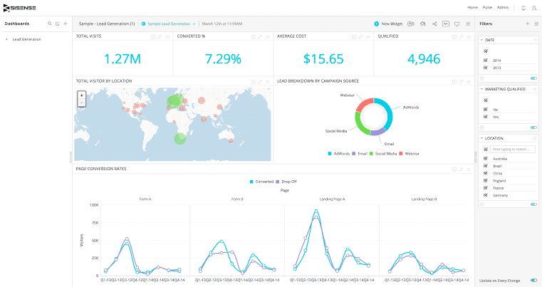
Insights of Sisense System
- This program is easier to set up and learn. One can install it within a minute and get their work done and get the actual result instantly.
- Sisense helps the users to export their files to many formats such as Excel, MS Word, PDF, PPT, etc.
- Sisense is a corporate and user-friendly software as it helps users to get access to the same file with one another among workers and co-workers.
- Sisense is budget-friendly to its customers, and it gives instant technical support to the customers.
- It can track data, and users can integrate one sisense product with any other sisense products.
- Sisense has an individual part for providing full-time support to its customers or users whenever they face difficulties.
2. Looker
Looker is an easygoing and fluent data visualization tool that can go deep to more in-depth data and analyze it. Looker gives an outstanding data visualization design that makes the interpreted data so soothing to view for the viewers. It makes businesses stirring so that the companies can make instant decisions based on the data analyzed and visualized. Looker is renowned for its detailed scrutiny.
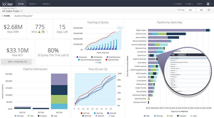
Insights of Looker System
- Looker users can use the standard language for a database management system that is called SQL (Standard Query Language) for arranging unarranged data.
- It has an attractive and effective model for data organization, which helps to make the analytics fun to see and accumulate the necessary data quickly.
- Looker is easygoing because the interface is not complicated, and the software itself helps itself to organize data.
- It can be shared with anyone, using any tool at any time, and also exported the file in any format immediately.
- Users can create their working interface following their choices, which fluents their works, and this makes Looker one of the top data visualization tools.
- Looker takes care of its users by giving support whenever users want. They do not want to keep any question ignored or unanswered.
3. Periscope
Talking about advanced data visualization tool periscope’s name comes first. It accumulates every data from every data source and then organizes them to make it more engaging and more accessible. Users get full support from this advanced analyzation tool and can understand the current situation of their business and take an instant decision for the growth of their business.
Insights of Periscope System
- Periscope has a separate option to meet a user’s choice of visualization and let them create an interface following their preferences.
- Here, coding is not necessary to get data from different sources and discover the new analyzed organization of data.
- Periscope uses different database management system tools to manage to connect data collected from various sources for useful analysis.
- Maps, Grids, Charts, Graphs, etc. are essential for data. Periscope has an extensive collection of these items to engage viewers more effectively.
- Periscope allows sharing data among different people in a company and also ensures the security of the shared data.
- To secure the data on their site and keep users safe, Periscope has built a cloud security infrastructure.
4. Zoho Analytics
Zoho Analytics is a data visualization tool where data are analyzed by different mechanisms and finalized a report based on the data. Users use Zoho Analytics to generate a proper and perfect report on their business and move to a final decision for the benefit of their company. It is a highly secured self-service business intelligence that smoothens the workflow of a company ensuring its accessibility with the permission of the users.
Insights of Zoho Analytics
- Zoho Analytics uses an encrypted connection to ensure the security of the data that users analyze here.
- It allows multiple access in a single file with permission, which fastens the workflow in a company or among companies.
- To support its users, Zoho Analytics has a separate dashboard for a report where users can report, and Zoho Analytics gives a solution to them.
- The packages are so user-friendly as well as the interface of working on this online site to make the users feel relaxed during work.
- Files organized in Zoho Analytics can be exported in any format such as MS Word, Excel, Spreadsheet, PPT, PDF, etc.
- Zoho Analytics has four types of pricing options including a free trial version, yearly plan, and monthly plan.
5. Tableau
Tableau is a helpful data visualization tool by which users can simplify the data and get a clear output based on the data analysis. Tableau is famous for its fast creation. Companies prefer Tableau to use for data analysis as it takes less time for output than other software. It is also malleable to use and also secured for data.
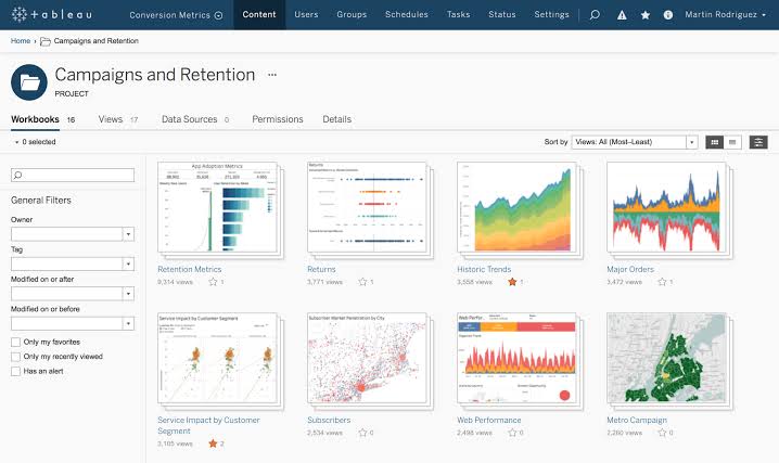
Insights of Tableau System
- Its way of data analysis is entirely customizable, which means users can customize the data following their choice.
- Through Tableau edited, organized, and analyzed data transfer is possible, flexible, and easier to any device.
- On Tableau, finding data and working on it is more comfortable because of the feature of limited permitted access.
- Users can find it super fast in connecting and integrating data from different sources, and they can visualize it as their own choice.
- Tableau is a budget-friendly data visualization tool with a team for 24/7 support to the users, whoever faces problems in using it.
- Tableau is promised to instantly react to the security issues right after it arises naturally or found by users.
6. Domo
Domo data visualization tool is a business intelligence platform where decision-makers of a company can get instant data of their business and reach a final decision for a situation. Domo is available for every business organization. Domo is the first data visualization tool depending on which a full organization can be run as it was self-service based and utterly open to all for use.
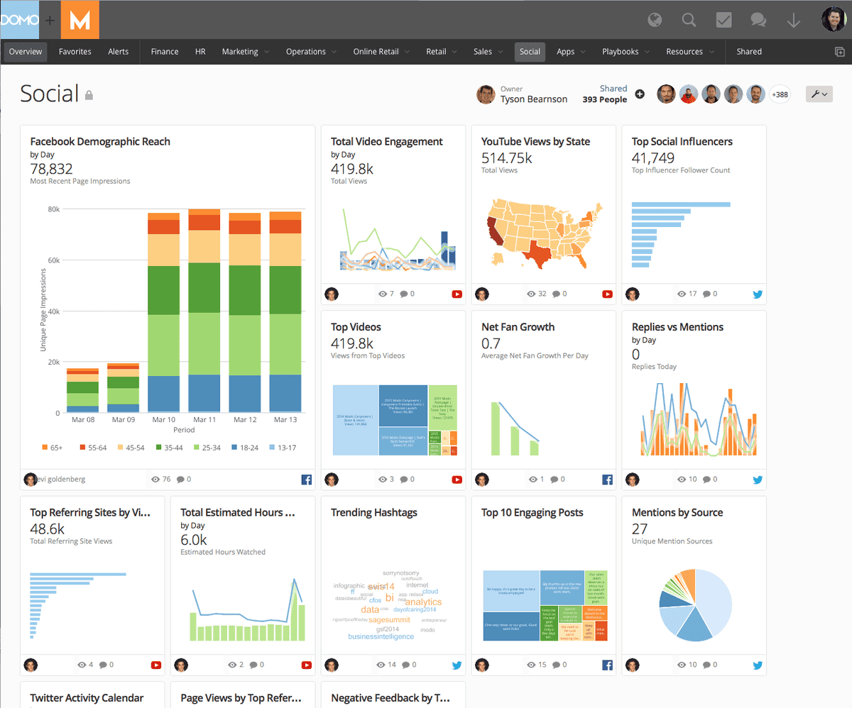
Insights of Domo System
- Domo has a free trial option for its users so that users can use it in a way they want.
- This data visualization tool always tries to keep its users informed through any way of contact, which makes it exceptional.
- Domo allows the users to customize the working interface as their choice of what every user wants.
- It has an outstanding feature of sending messages from user to user so that works become fun and smoother and done through discussion.
- Domo can integrate data from multiple sources and accumulate them at one place to analyze quickly and clearly.
- Domo has a fixed time for customer service, and that is 7 AM to 6 PM from Monday to Friday.
7. Microsoft Power BI
Microsoft Power BI is a platform where data are analyzed, aggregated, and shared. It connects more than one source of data and collects data and accumulates which are related and helps to build up a visually aesthetic and graphically gamified data. Microsoft Power BI data visualization tool believes that every data is an opportunity. So, giving value, they secure every information finalized on their site.
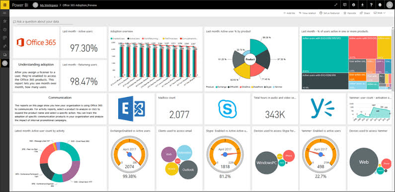
Insights of Microsoft Power BI
- Microsoft Power BI can combine wide-spread data integration from third-party software.
- Microsoft Power BI is a budget-friendly software that offers only $9.99 so that many analyzers can access this data visualization tool.
- Through the publication of data, collaborators can get access to the published data, and it is possible with this program.
- Users can access unlimitedly into their in-cloud data system on Microsoft Power BI, which makes it one of the top data visualization tools.
- This data visualization tool helps beginners with a tutorial on how they can use it in a disciplined way.
- It has a multiple support system such as FAQ, guidelines, search options for specific information, and users can also get in a live chat with the staff.
8. QlikView
QlikView is one of the most malleable programs which is used by more than 24,000 organizations all over the world. It has become one of the top data visualization tools because of its simple and easy interface. Users can clearly understand its functions. Analyzing data on this software is more flexible, which makes this program more accessible. Users feel easier for their understandable pattern of data analysis.
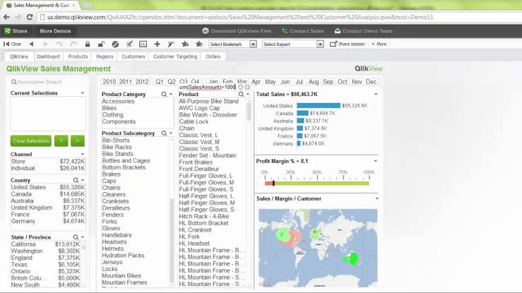
Insights of QlikView System
- QlikView gives the benefit of creating visual contents following the user’s own choice so that users can get a perfect output as the user’s thoughts.
- To meet the need for data or templates or any other thing instantly, there is a search option to find out that from any corner.
- Data access can be shared with different collaborators, and they can edit it, organize it, and redecorate it.
- QlikView is economically beneficial as workers for information technology are not needed because of the program’s built-in memory.
- This data visualization tool works quickly, takes less time, and gives a complete outlook of an organization.
- It has multiple support systems for customers based on the criticality of the issue made by a user that needs to be solved.
9. Klipfolio
Klipfolio is a Canadian company that has a fixed focus on business intelligence. It is one of the top data visualization tools which is connected to various types of data sources. Klipfolio is so much easygoing software because of its built-in functions for every activity that may be needed during data analysis, and the program becomes helpful to the users as users can understand every feature and their use correctly.
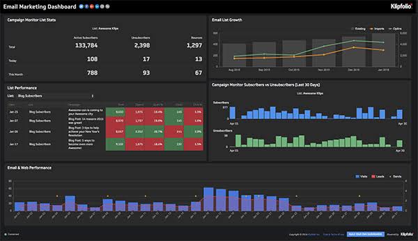
Insights of Klipfolio Tool
- Klipfolio has a bunch of templates in their stock, and also it allows users to create a customized dashboard based on their choice.
- As it is connected to 500 different sources of data, users can get the desired data whenever they want from wherever they want.
- Decision-makers use klipfolio to understand business growth and what steps they should take in the future.
- Klipfolio offers a free trial of 14 days, and users can access as much as they want in these 14 days.
- This data visualization tool is not so costly for a starter company with a small team. It only charges $29 per month.
- Klipfolio has two options, which are community forum where other users may answer and knowledge forum where an unknown thing of the program can turn to known.
10. SAP Analytics Cloud
SAP Analytics Cloud is a business intelligence platform that provides the service of data visualization. This tool has every analytical function in one single page. Users can get real-time data of their business using this program. Moreover, SAP Analytics Cloud can make a complete model for a company utilizing every data integrated from different sources by a user.
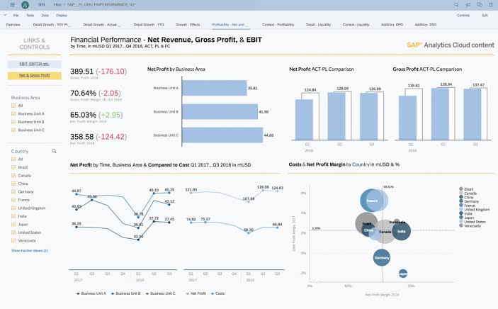
Insights of SAP Cloud
- SAP Analytics Cloud gives the surety of security every data on which users worked on this program.
- This visualization tool comes with a feature of importation and exportation files or data.
- SAP Analytics Cloud has an option of free trial for 30 days so that users can understand first if they can use it or not.
- It has considerable pricing for its user, and that is $22 per month. This is cheaper than most other programs.
- Users can make a report using this software based on the analyzed data, and users can manage the access by adding collaborators.
- SAP Analytics Cloud is available 24/7 to give help or support to its customers to satisfy them with the solution.
11. IBM Cognos Analytics
IBM Cognos Analytics is an advanced business platform that has the ability of data integration, exploration, and data modeling. People can use this program for faster result, and finally, they can make quick decisions for their business. IBM Cognos Analytics gives a detailed output based on data. What makes it one of the top data visualization tools is that even if users with zero knowledge about technology come to this site, they can use it easily.
Insights of IBM Analytics
- A new feature is an AI assistant who answers the user’s questions naturally and suggests further information to add after data or information.
- IBM Cognos Analytics allows users to integrate data from more than one source to let users feel flexible enough.
- This data visualization tool allows users to customize their reports following their choice or company’s demand.
- IBM Cognos Analytics can be a simpler one for beginners, but it is so influential for the professionals.
- It can clean and refresh data and make a model of a company based on the data of the company finalized using this program.
- IBM Cognos Analytics has a particular portion for helping its customers at any time to save them from difficulties, and this portion is genuinely helpful.
12. Kibana
Kibana is a data visualization tool for mainly time series analysis, which means it gives the analysis of data analyzed in a specific time. Kibana is helpful in many ways for this feature as it provides time to time data about a business or company.
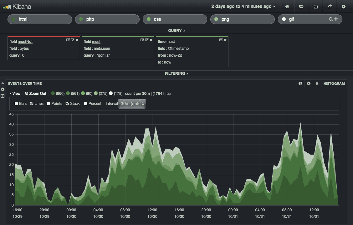
Insights of Kibana Tool
- It has a new feature called Elastic Stack, which enables searching any data from anywhere in any format.
- Kibana can detect any dissonance and any spoofy thing in data, which makes it exceptional than other data visualization tools.
- It can easily find and detect relations within every data and gives a visual to the user, which is also a unique function.
- Like other data visualization tools, Kibana also allows dashboard sharing with collaborators for fluent workflow.
- Kibana also allows URL embedding in data and shares it with collaborators or colleagues so that users don’t face any trouble in work.
- Canvas is an exciting feature of Kibana that enables users to make their data colorful, change the text, shape, etc.
13. Plotly
Plotly is an open source data visualization tool that helps to make different graphs, charts and even scientific graphs that users can use in other science-based data visualization software. Plotly is a Canadian company that was built using Python, Javascript and Django. This data visualization tool is generally to analyze data of web applications, and users can check data of their web apps for modification.
Insights of Plotly Tool
- Plotly is free. Users can analyze data online or offline using this open-source data visualization tool.
- Plotly has an option named chart studio where users can create web-based templates following their needs.
- Plotly allows customers to make the dashboard as they want and share the data with whoever they want as collaborators.
- Plotly has a variety of charts and graphs. Users can make 2D or 3D chart selecting from the library.
- Plotly has an option called Customer Satisfaction Algorithm, which accumulates reviews by the users and workers of Plotly try to solve it as quickly as possible.
- Plotly offers bounty rewards if any user finds one or more vulnerability in their program and report it to the authorities.
14. Chartio
People find it challenging to find out every data and information and link them with other data from another source, and so many insights of business remain missing. Chartio focuses on the flexibility of the users helping them to integrate data from different sources and gather them together so that no data remains hidden. Chartio is a solution as its outlook is easier to understand.
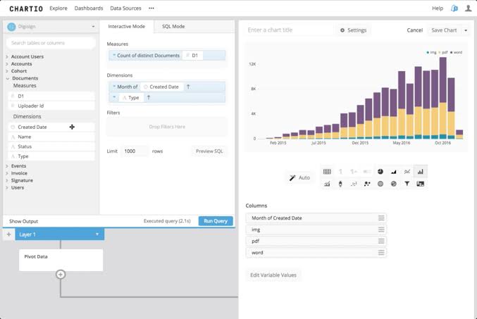
Insights of Chartio Environment
- Chartio is available for all types of businesses, mainly small and mid-level companies so that every company gets the same benefit.
- Chartio is easier to learn because of its simple setup option, and users can learn fast how to use it properly.
- This is one of the top data visualization tools that come with a free trial option for the new users so that users can come to know about its general features.
- Chartio has three types of pricing options, namely Startup, Growth, and Premium, and price varies in each option.
- It has an option to customize the dashboard, and it also has a relational display to show the relationship between data from multiple sources.
- Chartio help center helps users to get out of the difficulties they get in while using this program.
15. Infogram
Infogram is a web-based data visualization tool that users love since it was launched in 2012 because of its simplified functions. It has an aesthetic looked design that attracts the users to use it. People can create beautiful charts, graphs, maps using this tool. People want the maximum support from a web-based tool, and Infogram is famous for its support system too.
Insights of Infogram
- Infogram has 20 templates already made by its workers, and users in a wide range use it all over the world.
- Infogram is exceptional because users can add photos, GIFs, icons in their report following their choice.
- It is one of the top data visualization tools because of its 24/7 support towards the users who find difficulties. Even it provides an account manager to analyze the data of a user.
- Infogram has a pricing of $19 per month though it has another free version.
- Like other data visualization tools, people can customize their dashboard as their choice and comfort.
- Infogram can be installed on both Windows OS by Microsoft and Mac OS by Apple.
16. Highcharts
Highcharts works with chart-based data only. One can analyze a bunch of data made with charts using this data visualization tool. But the condition is data charts must be coded in Javascript. The visualization tools nonprofits generally use this data visualization tool. But it has a pricing system for its commercial use. So, Highcharts can be said to be open source in a sense and also a closed source in another perspective.
Insights of Highcharts
- Highchart comes with a free trial version and can be installed on both Mac OS and Windows OS and can be connected on mobile too.
- It has some pre-built templates which users can use as much as they want, and this makes it one of the top data visualization tools.
- Users have the option to create data modeling on their analyzed data charts using this data visualization tool.
- On Highcharts, charts can be imported in any format such as PDF or JPG, etc.
- There is a tutorial or documented video for the beginners who are using this Highchart data visualization tool.
- Highcharts prefers email for complaints and requests users to mail the authorities to let it know about the issue.
17. Visme
Visme is the data visualization tool that is used to make presentations and visualizations. There is less time to read mass data and also dull. Visme helps to make these boring data exciting and engaging to the viewers. It’s a content creating tool that is widely used by nonprofits and students. Leading commercial people use it to make presentations for their companies.
Insights of Visme Analytics
- Visme data visualization tool provides the advantage of saving a data presentation on their site for future use.
- Visme costs $12 per month per person, which is so much cheaper than other data visualization tools.
- This is one of the top data visualization tools because it allows users to link different data from multiple data sources and share them with other collaborators.
- These presentation based data can be integrated into any applications available by Microsoft Office.
- It is one of the top data visualization tools because of its all-day, all-night support towards the users both on hotline via representative or online.
18. Geckoboard
Geckoboard is an online-based data visualization tool that was launched in 2011 in the United Kingdom. It is an advanced data visualization tool that helps decision-makers of a company to set a goal with a dream to reach the goal within a particular time. Geckoboard keeps users always up to date. This data visualization tool is basically created for small and mid-level businesses and also must be an online business.
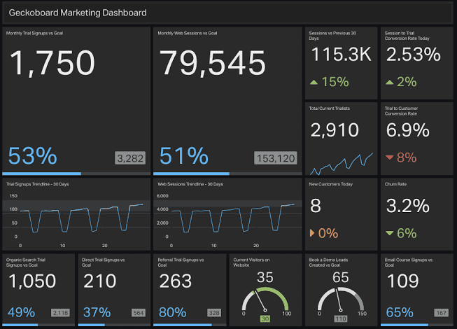
Insights of Geckoboard
- Users can create a custom dashboard and even add a logo on Geckoboard as per their need or choice or demand.
- Geckoboard has the technology of capturing the actual data and process it to convert it into a rhythm.
- This closed source data visualization tool allows users to integrate data from multiple sources and accumulate them on a single page.
- Geckoboard costs $25 per month per person though it offers a free trial version to the beginners or the new user on this site.
- Geckoboard has become one of the top data visualization tools because it provides 24/7 technical support online and offline.
19. AnyChart
Anychart data visualization tool is a platform where users can make a visual of charts and connect that with any other destination. This top data visualization tool is famous for its great and fast data analysis and built-in graphically attractive charts. A viewer can easily get engaged with the presented charts made with AnyChart. AnuChart is very much helpful for nonprofits.
Insights of AnyChart Solution
- AnyChart has a huge variety of charts that are engaging, interactive, and attractive, which makes it an exception than other data visualization tools.
- It allows users to share analyzed, edited and organized data with whoever they want and whenever they want.
- Despite having a trial version, AnyChart costs $79 per user, which is higher than most other data visualization tools.
- AnyChart offers training facilities to beginners if they need it. The training may be held in person or online or through a documented video tutorial.
- This is one of the top data visualization tools because of its immense support to the users to solve their problems and satisfy them.
20. FusionCharts
FusionChart is a web-based data visualization tool that is mainly recognized as a javascript charting library. It was launched in 2002, and till now more than 8,00,000 developers have used it and using it all over the world. FusionCharts has an extensive collection of charts using which users get the attention of the viewers. FusionCharts has earned the leadership for its beautiful visualization and analysis.
Insights of FusionCharts
- FusionCharts is enriched with 90+ charts and 1000+ maps, which make data interactive, engaging and also give it a connotation.
- It consists of a relational display which shows the relation among chart data from multiple sources.
- FusionCharts has a trial version for the new users to let them understand the general features and then step forward.
- FusionCharts costs $199 per year per user to use its every function and utilize every resource in it.
- FusionCharts offers a training session with a documented video tutorial to the new users, and it also helps online whenever users face difficulties.
Finally, Insights
Data visualization tools are essential for every company in general, and its support is immense to describe. The world’s economy and technological advancement equally depend on this data visualization tool directly or indirectly. When data organization is faster, the decision making is quicker too.
Moreover, these tools make people think out-of-the-box, and they implement their decision for a company through an aesthetic report that is visually satisfactory and understandable for everyone. Companies should have faith in data visualization tools. More the faith in data visualization tools increases, the faster the growth of a business becomes.
Related Courses – Learn Online Now
RPA (Robotic Process Automation)
Machine Learning with 9 Practical Applications
Mastering Python – Machine Learning
Data Sciences with Python Machine Learning
Data Sciences Specialization
Diploma in Big Data Analytics
Learn Internet of Things (IoT) Programming
Oracle BI – Create Analyses and Dashboards
Microsoft Power BI with Advance Excel